Related Posts Plugin for WordPress, Blogger...

9.21.2011

Client Project: A Fabulous Before & After

A while back (a long while!), I posted here about a client kitchen project that was in the works.  The kitchen remodel has been complete for a while, and I finally got around to taking some amateur "scout shots" of the space.  I wish I could share professional photos with you (those are in the works), but I'm so excited about how this turned out that I couldn't wait to get these pictures up.  I do need to say first that I believe a large portion of the success of this project is the wonderful clients I had the privilege of working with.  They were the perfect balance of stylish, receptive, intelligent, and realistic with their expectations, and I loved the working relationship we had.  My hope is that they'll enjoy this kitchen for years to come, and that I'll get to work with them again in the future!

Here are a few before photos of their space:


 The main space was cut up into three side by side rooms--a dining room, small kitchen and bedroom at the back.  The house had also been used at one point as an "apartment-style" space, so there was a back staircase that was disconnected from everything, but needed to be integrated to make this a practical single-family dwelling.  The design took the three separate rooms and opened everything up into one large, long area.  We managed to fit a nicely proportioned island, and create zones for cooking, prep, as well as serving.  The back staircase was opened up to the rest of the house, and it now integrates beautifully with everything else that is going on.  Here's how it turned out:


The major challenge here was to create a functional cooking/eating/living space while maintaining the integrity and charm of the 1920's home.  Open floor plans are not always the best solution, especially in older homes, but it works here because we've maintained some doorways and divisions that help each area feel distinct, but still open to one another.  Additionally, materials like natural cherry and soapstone speak to the age and aesthetic of the house, and tie in beautifully with the original dark woodwork.


Overall, this project turned out better than I could have imagined.  There are still some finishing touches to be installed (like FABULOUS backsplash tile--stay tuned!), but as a whole, I think the design is a success, and the homeowners are happy, which is the true goal of any designer.  Again, my apologies for the less-than-desirable photography.....I'll update once we get a professional in there!

9.15.2011

Black & White & Wood All Over.........and Some Exciting News!

The injection of rustic elements into a clean modern space continues to gain popularity and be seen everywhere.  Maybe its the unexpected pairing of clean lines with rough finishes that makes it so appealing, or maybe its that we're ready (and have been for a long time) to see interiors that aren't so matchy-matchy.  Currently, I'm drawn to the stark nature of black and white, paired with warm rustic wood and driftwood tones.


Love how this second image marries the very modern with those industrial, vintage chairs.  Such an unexpected mix, especially with that stone floor.  It all works, and is refreshing instead of stark.


This relaxed, but beautiful space uses a "colorless" backdrop to showcase and highlight various wood tones and textures.  It mixes the perfect with the imperfect so well, and looks very comfortable to live in.  Check out more great photos of the house here.


That pine ceiling has such a cottage-like vibe, but when paired with sleek surfaces, that great modern hood, and those architectural window coverings, there's a nice harmony here.

via Pinterest

Love some of the details in this kitchen--the natural rug against that gloss white floor, the leather pulls on the drawers, and the casual rustic cabinet for open storage of dishes.  The look is gracefully unfitted, and it works well.


I've seen this kitchen in many different places and can't get enough of it.  The strong, dark outline on those island pieces punctuates the space, while the rough-hewn beams flanking the doorway and grey-washed floors add a casual softness.  


And in other news........a certain other kitchen with some black and white tones of its own got a bit of recognition this week:


I revealed my own kitchen a while back, and got some great response.  On a whim, I entered it in a state-wide design competition, sponsored by the National Kitchen & Bath Association.  I'm pleased to announce that it took 3rd place in its category!  Maybe to some people, third place is the "second loser", but given the criteria and the other kitchen designs I was competing against, its a proud moment for me, and I'm thinking this space is truly "the little kitchen that could".  There may be some magazine recognition for me in the near future, so I'll let you know if that happens!

9.07.2011

An Original Take on an Unoriginal Idea

I've officially entered the "nesting" stage of my pregnancy.  Actually, with all that's been going on around our house I feel like I've been nesting for months, but now things are in high gear.  My latest project has been creating letters to spell out our son's name somewhere in the room.  Everyone does this, and although I'm not sure what the reason is (the baby can't read), I love the look of bold graphics and lettering, so I wanted to do it too :)  I found these letters, and although I liked them, I thought I could do a better job and make them more personal.  So an unoriginal but interesting idea was born.

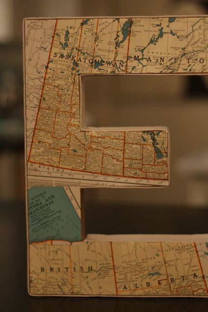
I thought it would be neat to create letters out of maps that show where both myself and Mr.CottageModern are from--me from Canada, and him from Minnesota.  I found these maps of various Canada/U.S. regions in a perfect array of turquoise and orange to complement the room.


The maps came from a place called Hunt and Gather.  If you live in the Minneapolis area, this is the most terrific antique/"vintage stuff" store, and definitely worth the visit.  Its quirky, always changing, and off the wall in all sorts of ways.  I go there every couple of weeks and always find something that makes me smile.

After I figured out which maps would go on which letters, I got to work piecing it all together.


The letters I used are those simple, inexpensive cardboard ones you can find at any craft store.  I also used my favorite product for gluing paper to paper:


And after the initial panic of the "do not use while pregnant" warnings splattered all over the back of the bottle (discovered after I'd completed a couple of letters), Google calmed me down and I realized that I probably hadn't used the product long enough or in a way that was harmful to the baby.  This stuff is great--you apply it to the surface you're going to glue on--in my case, the face of the cardboard letter, as well as the back of the item you're gluing (the map).  Let both surfaces dry, then carefully adhere them together and it creates a tight bond.  The best part is, if you get glue on any surface you don't intend to, it rubs right off once it dries.

As a finishing touch, I added canvas around the edge of all the letters (also an unoriginal idea).  I started by cutting strips of natural canvas slightly larger than I needed, then using Stitch Witchery and a hot iron to bond and finish the edges.


And here's the finished product:


I used craft glue to adhere the canvas to the letter, and the result is a nice clean edge.  The color of the natural canvas also complements the tone of the vintage maps.


Well, there's a little sneak peek--I love how these are turning out.  We are keeping the name a secret, and I've probably already given away too much by revealing two of the letters.  Any guesses? :)  Check back in about five weeks and we should have the name (and the baby!) ready to introduce to the world!